Roots fans the season is nigh!
The Roots debuted today their 2026 Home and Away kits, featuring a classy inversion of their 2024/25 home kit and a black sublimated-dragon kit, not respectively. This prompted some discussion of the best Roots jerseys of all time, and because we have a blog, our rankings get published on a somewhat official-looking website instead of the comments on Discord.
Here is a slideshow of the jerseys being ranked:


DEFINITIVE RANKING
- Meyba Home Black 2023
A cool kit manufacturer. Brilliant combination of simple black with the mosaic in a way that is not too busy. Jerseys looks great on the field. Instantly recognizable as a Roots kit. Unfortunately, the players apparently hated the feel of the jerseys and Meyba had supply issues that prevented the Roots from restocking.
- Meyba Special Black Panther 2023
I almost don’t want to include this in the list because of its limited run, limited use on the field, and extremely political subject matter. To be clear, political subject matter that I am supportive of, but it almost feels wrong to put this in the list below a jersey that I just thought aesthetically looked better. I also never got fully comfortable with the idea of wearing this jersey for fear I would look like that picture of Nancy Pelosi wearing kente cloth.
- Charly Away White 2025
I loved using an old school baseball-style design to honor the Athletics for the first season in the Iconic Oakland Coliseum. The green and white were extremely clean and, for an away kit, still very identifiably Roots. I think my biggest gripe with this jersey is that they kept wearing it for home games (and also played like shit in them). Justin Rasmussen scored that bike in this kit, though, and that is pretty iconic.
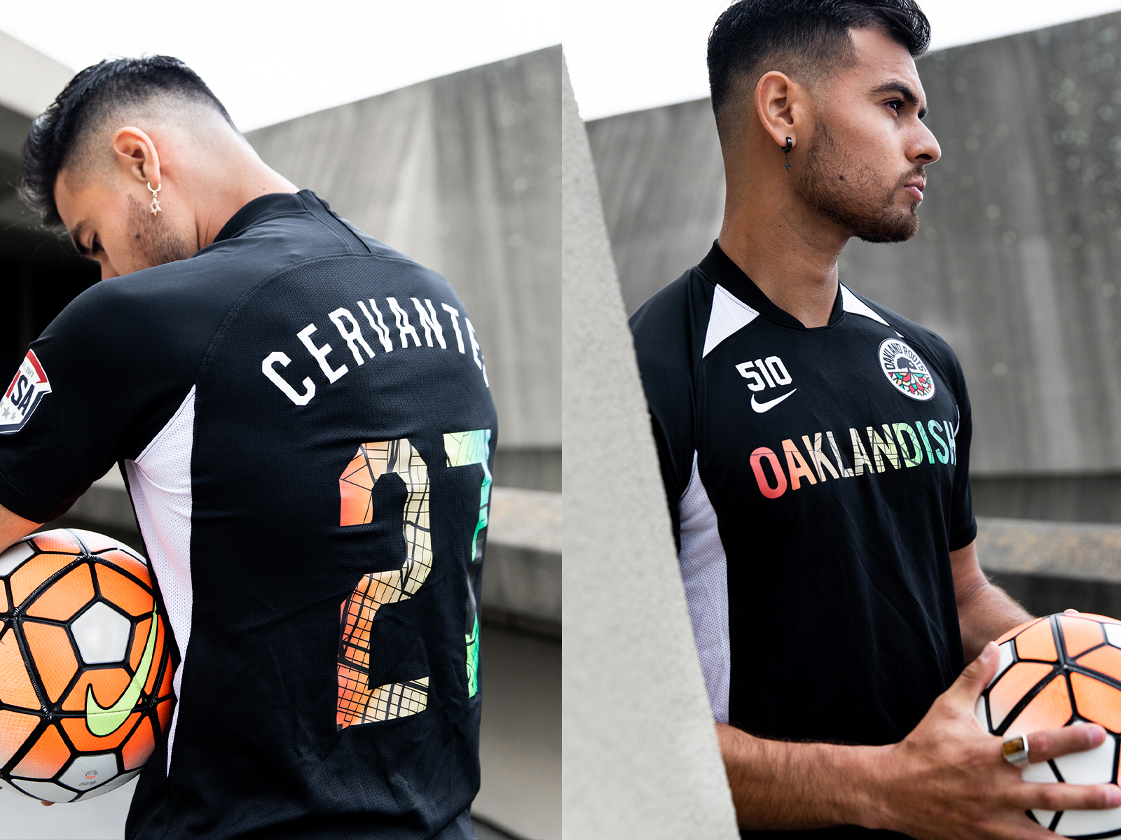
- Charly Home Black 2026
The Oakness Monster kit. Without having seen this on tv or on the field it is a little hard to rate precisely, but I think this one looks like it will rate as a clean black kit with some shine from a distance, and that is a great look for the Roots. (see, ranking of Puma Home Kit 2022). Up close it has some really cool detail. I am not sure I exactly care about the legend of the Lake Merritt Monster. I’d say I like cryptids but I’m not a big cryptid guy, and I have still never really heard anyone mention this. Still, the dragon is pretty cool looking.
- Meyba Away White 2023
I like it for all the reasons stated for the Meyba Home Black 2023 listed above, but I think that the mosaic shoulders on the white kit are not nearly as cool with the white as the black. I think the white kits need something darker on the shoulder. For instance, the Charly Away Whites 2025 looks cleaner.
- Puma Home Black 2022
Very simple, very straight-forward, but still recognizably Roots. The badge really pops against the simple black jersey. I’m not sure if it was supposed to be Raiders black and silver. We also flew in this kit in a lot of games.
- Puma Away Green 2022
Like the black kit from the same year, but in a color I didn’t (and still don’t) really consider to be a Roots color. As an homage to the Oakland flag, sure, but it codes as an homage to the Athletics which is cool but does not tug on my heartstrings.
- Charly Away White 2024
The best of the big vertical-stripe kits. I think that the problems of the others are mitigated by having the mosaic in grays, although from a distance I think it’s just a gray kit. I think the green collar and pink piping are both absolutely excellent. The sublimated Tribune Tower is probably my favorite hidden detail in any Roots kit.
- Charly Away White 2026
My thoughts on this kit are basically what I write for the home black. I think this one is better because it is less visually confusing.
- Charly Home Black 2024/25
Annoyingly, the only jersey we’ve ever run-back has been one of my least favorite. I think this vertical stripes with mosaic looks… busy? Half-baked? I don’t think you could do a full-kit mosaic, and this seems like it has a lot of the downside of that. It’s looks like a kit designed to foil computerized pattern recognition. I think it also suffers from the sponsor breaking up the pattern in an especially jarring way.
I will grant that it is immediately recognizable as a Roots jersey. I just almost wish this one wasn’t.
Can someone mock up a black Roots jersey with a single diagonal sash of mosaic? That might be cool as hell.
- Puma Home Black 2021
This is the worst offender, I think, in the Roots’ difficult history with jersey patterns that are cool up close but meaningless from a distance. The numbers and names were very difficult to read from the tv and from the stands, as well. I liked this jersey a lot better before I knew it was a Puma generic template that other clubs would wear in other colors. I think Roots’ black was the best of the bunch, but still disappointing.
- Puma Away White 2021
All of the problems with the 2021 Home Black kit while being even more difficult to read player numbers, more generic, and less recognizably Roots-y. Really the only good thing about this kit is that the Roots badge popped against the white/gray.
Unranked: Charly Moma Third Kit 2025
I was afraid this was going to look terrible on the field and it actually looked pretty good. The jersey grew on me after the initial announcement, but it still looks to me like a cool proof of concept rather than a cool soccer jersey.
DISSENTS
Aaron
I can mostly tolerate difference of opinion, but I think any rational ranking of Roots’ jerseys should abide by three principles: (1) The 2023 jerseys were the best range, and should all be near the top. (2) The 2022 Home Black jersey should be more or less right in the middle. It was extremely adequate. Thoroughly whelming. I am unsure if it is even possible to have strong feelings about a plain black shirt. (3) The 2021 jerseys were a swing and a miss. Great idea in theory, and we were all obviously pretty excited about them, but with the benefit of hindsight I think we can recognize their flaws. If you’re going to list something lower than those jerseys, you should have a good reason, like seeing one of the other jerseys causes your pet to go uncontrollably nuts, or your partner dumped you while you were wearing it. And even then, you ought to be able to put your emotion aside and realize that the 2021 jerseys were still worse.
So far, so good. But Bloom is obviously out of his mind putting the Tribune Tower jersey on the bottom half of this list. Astute observers will note that the Roots have settled in a pattern of one mosaic jersey, and one jersey with some Oakland reference, the exceptions being 2021 (too much mosaic) and 2022 (an overreaction to the previous year’s excess of mosaic, with no mosaic and 1 reference). (2023 is a half exception, with 2 mosaics, and 1 reference.) If we’re ranking how visually appealing what I’ll call the “reference jerseys” are (and excluding the SFMOMA jersey), Black Panther and Tribune Tower are pretty clearly the best. The green and gold jerseys are cool in their own way, but they are only climbing up this ranking if you’re giving Roots credit for referencing the flag or the A’s, not on their own visual merits. Call me crazy, but I think that color combo just works better on a baseball jersey, and maybe also if the text across the chest is “Roots,” “Athletics,” “Ballers,” or “Oakland,” and not the name of an insurance company. (Though if the Roots can pull off that soft gold the A’s wore in the 70s, I might change my tune.) Anyway, I can’t see how you’d place either of the top 2 reference jerseys below the black kit. It just doesn’t compute. An unexpected accent color, especially with a cool local/historical reference, will always make a jersey stand out. The only thing missing was a collar, see nearly everything Venezia puts out, 2025-26 Roma third, 2021-22 Liverpool away, and, in a different way, 2005-06 Arsenal home.
Jon
Bloom and I clearly have a difference in opinion. My top five go: No. 1, 2024/2025 Charly mosaic stripes, No. 2, 2019Nike black/white, No. 3, 2020 Black Lives Matter Justice Match, No. 4, 2024 Charly Tribune Tower, No. 5, 2024 Charly third kit.
The 2024/2025 mosaic stripes were well executed for me in comparison to the 2023 Meyba model, and the original 2019 jerseys with the huge mosaic numbers go to the top of my list. The Black Lives Matter jerseys are unique, and I personally loved the color scheme of the letters and numbers. The Tribune Tower may have been the most unique jersey the club has dropped, while I enjoyed how the club included its colors and roots in the 2024 third kit.
My bottom five from best to worst go: 2023 Meyba black/white, 2025 Charly white kit, 2020 Nike black/white, 2021 Puma white jersey, 2022 Puma green.
Sorry, Peter, the mosaic 2023 design looked too much like shoulder pads to me. The white jersey, in particular, reminded me of a bowl of Fruity Pebbles. With the 2025 white kit, I understand I may be in the minority here, but the A’s homage just wasn’t it for me. Don’t call it an Oakland flag shoutout when it looks nothing like the flag. Like Aaron, I would’ve liked an all gold jersey like the 1970s A’s if they really wanted a jersey that resembled the Oakland flag. The 2020 Nike kits had some uniqueness with the Oakland map within the numbers, but other than that, it was very meh with some awkward little triangles around the neck. The 2021 white Puma jersey goes near the bottom for me because of how difficult it was to read the number, but other than that, the black kit goes higher on my list because of the unique pattern that made its way to the Togo National Team. My dead-last kit is the 2022 Puma green jerseys; they were a stock Puma jersey with nothing creative about them at all. In fact, almost every team Puma sponsored in 2022 had the same model.